


Celebrating the NRL's Indigenous Jerseys
Celebrating (and explaining) the NRL's best jersey's

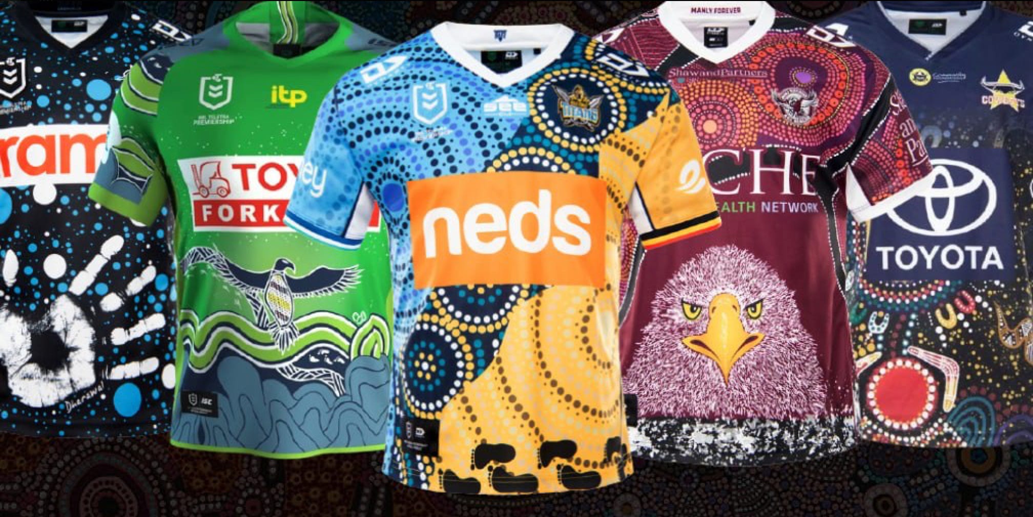
One of my favourite rounds of the year, the NRL Indigenous round, is finally upon us again and it’s not just the incredible jerseys that are the highlight. It means we get to reflect on the history and culture of Australia and its people as well as artists with immense talent getting their work seen by thousands.
From the stories behind the design, the journey of the Artists, indigenous culture and the jerseys themselves, let’s take a look at the incredible 2021 collection of Indigenous Jerseys.
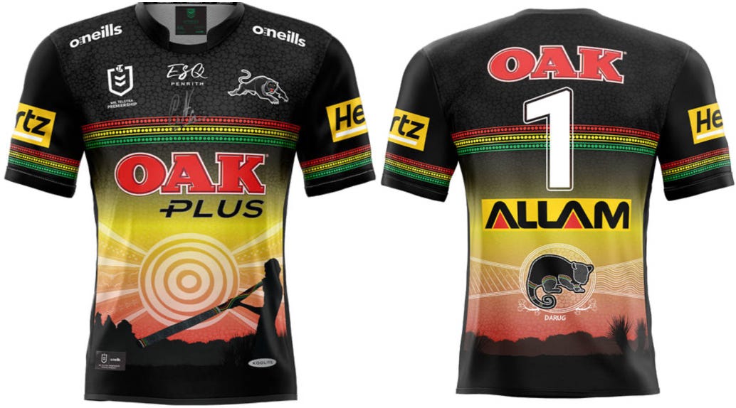
While keeping the Jersey very in line with their colour scheme and close to their normal kit, Natasha Fordham in Collaboration with the Panthers Indigenous Welfare Officer Glen Liddiard, has created a beautiful Jersey with the setting sun as the basis.
On the front is featured the meeting place of BlueBet Stadium on Darug land with kangaroo and emu tracks flanking it as well as the Three Sisters. A silhouette acknowledging the traditional owners of the Darug land is clear, made possible through the setting sun. On the lower back is the Darug Possom, “with fire on one side and flood on the other, representing the natural forces that impact the landscape and community” as stated on the Panthers website.
While it doesn’t have the flashiness of some other jerseys, the connection between the jersey and indigenous culture, as well as the land that the panthers play on is obvious and special.
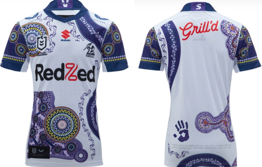
Circles represent the QLD bubble from the 2020 season and AAMI Park and the people that play their part - players, staff, family and members. This all represents the journey home.
I just love the colours of this jersey. Obviously trying to make a statement while not straying too far from the Teams traditional colours, Krsten Petrevski has made a beautiful looking jersey with plenty of meaning behind it.
From the Melbourne Storm Website, the art on the front is shaped like Victoria and the lines that join the circles represent the many cultures that link together to make the Melbourne Storm. The Yarra River running through the city is represented by the curved purple line and footprints represent the journey each player takes with the club while the handprint represents the five values the club holds dear: family, accountability, hard work, respect and passion.
The final little details are past and present indigenous players from the Storm are listed on the lower back, with the pattern on the lower right back representing all other cultures to have represented the Storm
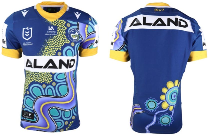
I love this jersey. It’s obvious (in part) what it represents and the colours are vibrant and different while still being blue and gold. Two rivers run through the Jersey, Parramatta and Georges, with the Parramatta River being used by the Burramattagal people, a clan of the Darug, as a source of food and a meeting place.
The representation of the Georges River pays homage to Pemulway, a great Aboriginal Warrior. Leading a raid in 1797 of 100 warriors in a battle now known as “the battle for Parramatta”, Pemulway was shot 7 times. The yellow dots beautifully represent those warriors. The Aqua blue ‘U’ shapes along the river are the Eels players, “the warriors of the game who bring the community together” while the back of the jersey represents the meeting place of the club, connected to journey lines that represent the players’ connection back home.
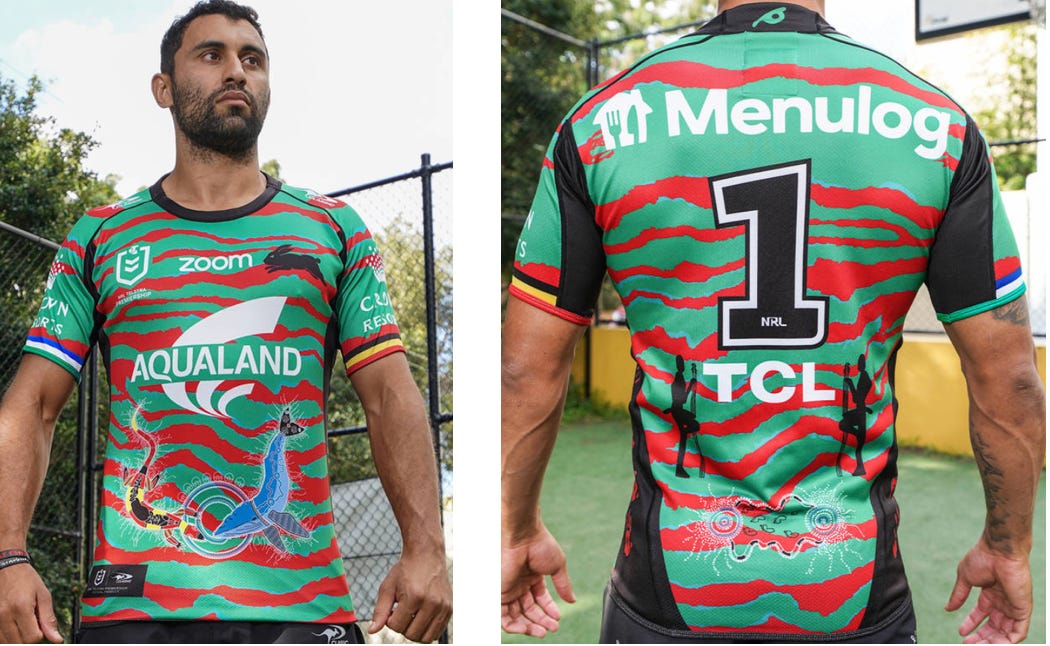
Facilitated by Joe Walker, Cody Walker’s Uncle and designed by seven participants from the ‘Souths Cares’ programs - Natalie Travato, Jayden Simms, Adrian Scanlon, Melodey Roberts, Tyreece Lyons, Mia Gregory and Imogen Grant.
The Rabbitohs designed is outwardly simple, staying very close to the traditional jersey. However, what it does include holds deep meaning to their players and the land.
The front depicts the sand goanna and the whale, totems of the Redfern and La Perouse areas respectively. This is repeated on the back, accompanied by the footprints of the seven Aboriginal and Torres Strait Islander players in the Rabbitohs squad (Cody Walker, Latrell Mitchell, Alex Johnston, Dane Gagai, Braidon Burns, Troy Dargan and Joshua cook). Also represented are Pemulway, and the handprints of those who assisted in the design down the sides.
I really like this jersey, but the Torres Strait Islander and Aboriginal flag colours on the sleeves are my favourite.
I didn’t love this jersey. The art is beautiful, just less obvious and harder to see. That was until I read about it.
I lost my little sister to suicide and I began painting as a bit of a coping mechanism. I kept going with it and have gotten a bit of success from it so I’ve kept at it.
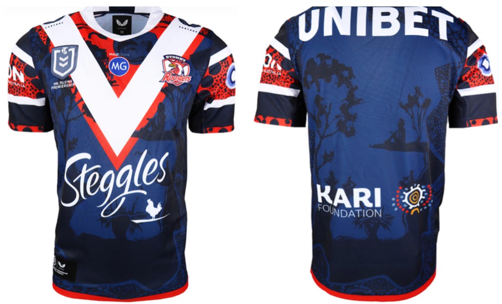
Late in 2019, Trent Robinson and some squad member visited bushfire affected rural communities. It was there, he found Jason Ridgeway sitting with his wife.
Jason is a proud Dunghutti man with six generations in the Kempsey area. He says it was “meant to be” after “Trent came up to us”. The wheels were in motion from then on and this jersey came to be.
“With the moon…we have a lot of different beliefs and stories that have happened during night time.”
With stability and protection from the moon as his inspiration, while keeping the famous red, white and blue and adding personal touches, Jason has created something special in the Roosters jersey.
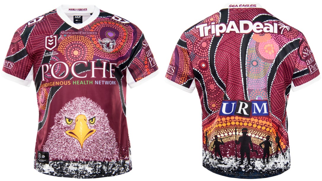
I bloody love this jersey. Does it have something to do with the sponsors not ruining it? Yes. Do the badass Eagle and Aboriginal Silhouettes also have something to do with it? Yes.
Created by Lee Hampton, the Jersey tells the story of early contact between the Eora (local word for people) and British Settlers in Manly Cove. Along the base of the Jersey, the white represents ‘Middens’, a build up of oyster and cockle shells, animal bones and charcoal.
Captain Phillip was impressed with the “confidence and manly behaviour” of the aboriginal people, hence the name Manly Cove. Trade soured and Phillip was speared, the “Sunrise with Warriors” on the lower back represents that. The black lines leading to the sunrise represent the trails that clans would take to come and traded the track used to reach the shoreline. The large circles represent the Gayamaygal people and where they live. The Sea Eagle, possibly the coolest feature of any jersey, is a confident hunters, precise when catching their prey — representing the Gayamaygal people with similar traits. Sea-Eagles also represent transformation — which, perhaps accidentally, couldn’t represent the Manly team of this year any better.
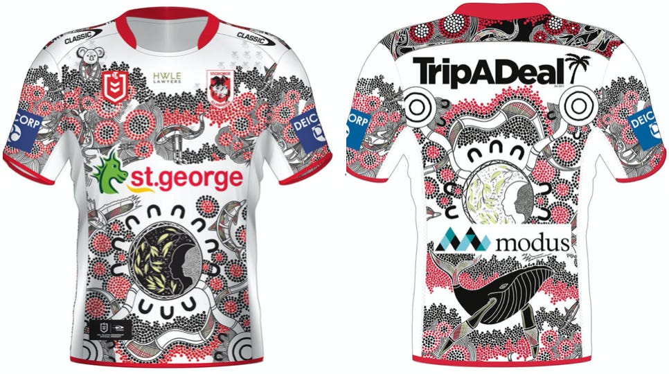
Created by Johnny Robinson, a proud Bundjalung man The Gathering, the art that this jersey is based on, represents coming together as one on ancestral Dharawal Land. The central circle symbolises the reconciliation of Indigenous and non-indigenous people, with Gum leaves and white dots within the circle representing traditional smoking ceremonies.
The three circles together represent the past, present and future Dragons players while the Humpback whale, the spiritual guide of the Dharawal people, is surrounded by dots meant to represent the people and Dragons fans.
I really love what this jersey represents, and the original artwork is incredible.
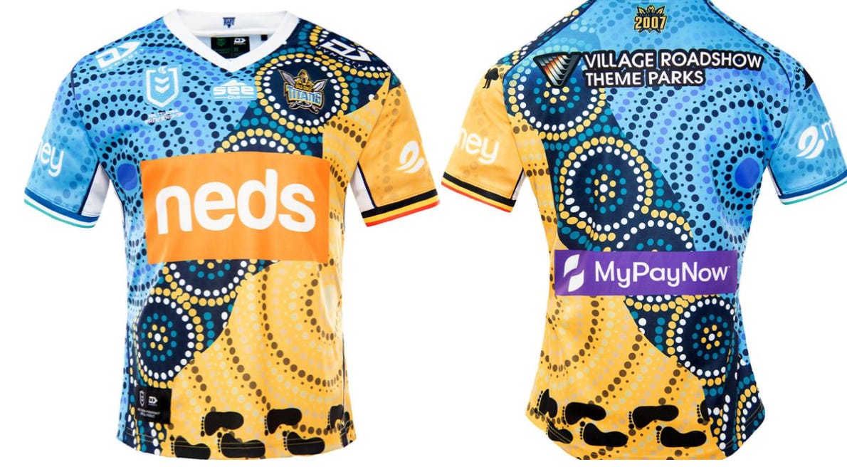
I think this is my favourite jersey. It’s a collaboration between indigenous Titan’s players and bought to life by Ashleigh Banks and it’s wonderful.
The Titans boast the highest representation of Indigenous players in the NRL and they all had input on the end product. Banks states that “The artwork that I have created represents the players not just coming together as Torres Strait Island and Aboriginal players but as a family…carrying their culture on their backs”.
The mixture of blues…represent the Torres Strait Island players and the sandy tones represent Aboriginal players… coming together to represent the Titans.
A simple representation but one that clearly means a lot to the Titans playing group and one that should do well with sales to fans.
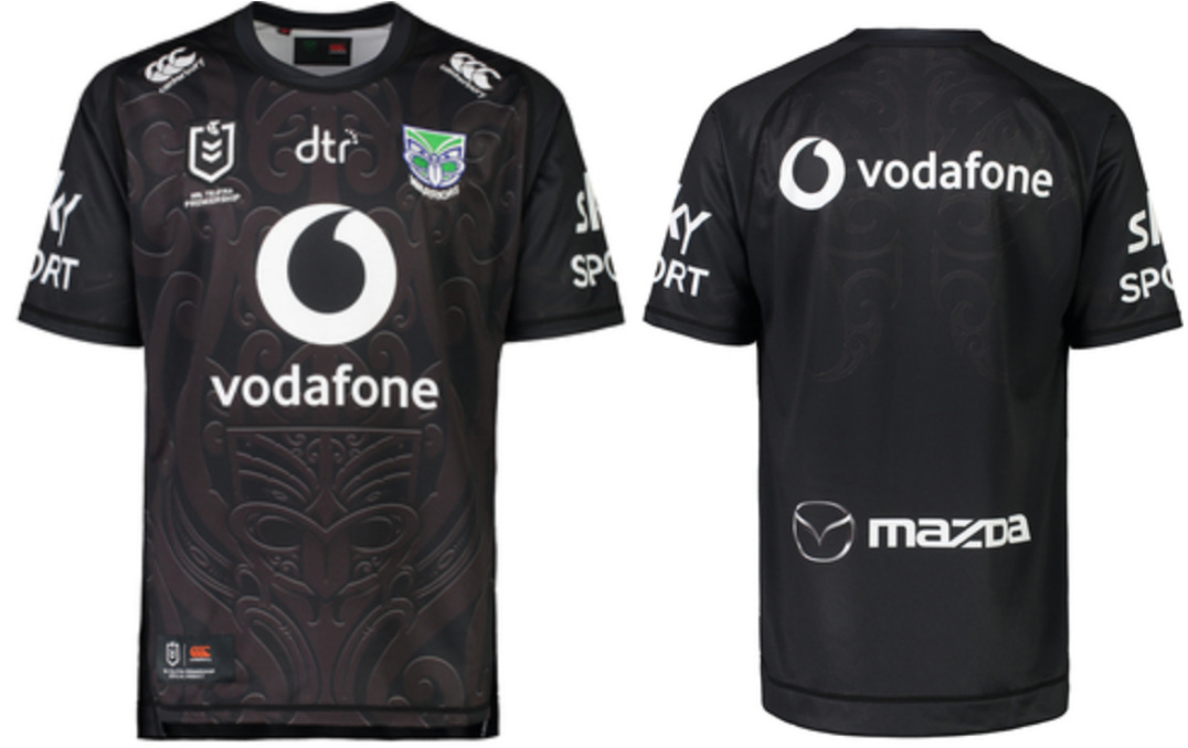
At first, I wasn’t a huge fan of this jersey. But with its subtle design and sleek black colour it’s has grown on me. It’s very different to the other team’s jersey with the others looking to be as colourful as possible but the black is striking. The colour of glory in New Zealand thanks to the All-blacks.
Honours Maori, the indigenous people of Aotearoa New Zealand. The design is brought to life through traditional artwork flowing across the jersey, representing guardianship and protection.
If I was a Warriors fan or just a New Zealand sports fan I would definitely be buying this.
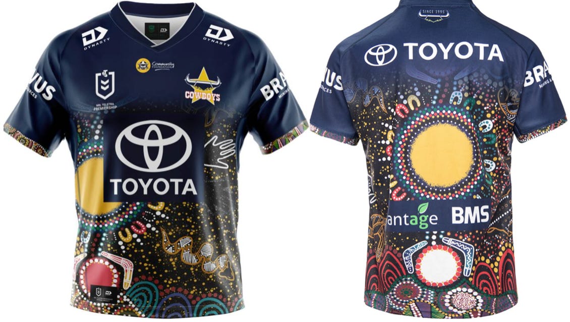
Now I know I just said the Titans was my favourite but… look at it! Titled “Aboriginal and Torres Strait Islander Dreamtime Unity”, Artist Jesse James states that his inspiration was
my connection to my Aboriginal heritage and also wanting to represent both Aboriginal and Torres Strait Islander people’s connection to our Dreamtime stories, both united and walking in one direction together.
While I’m no art critic and would need to have every bit of the jersey explained to me as to what it represents, I love how it looks. The colours are awesome and somehow integrate into the Cowboys colour scheme.

By now you’re probably getting the gist that I like a lot of these jerseys and I like the Raiders one more than most. With a lot of the other teams, the sponsor is intrusive but with the red and white of Toyota Forklifts, it somehow works. It’s simple and very Canberra Raiders. I wish they’d wear this for every game.
Designed by Rayne Huddleston and based on initial concepts from Justine Brown, the jersey represents the Ngunnawal people and the people of Wiradjuri nation. The Wedge-tailed eagle represents the Ngunnawal people of the Canberra region and its first inhabitants. The Goanna Totem on the other side represents the Raiders broader regional connects as well as Jack Wighton’s mob, the Wiradjuri Nation. The cross-hatching within the two totems comes from a sacred site and original place of the Ngukurr people called Burrunju City.
My favourite jerseys are those with special touches meant for the players themselves and this jersey has that, as well as keeping spectacularly to the teams colours and enhancing the jersey, rather than changing it totally.
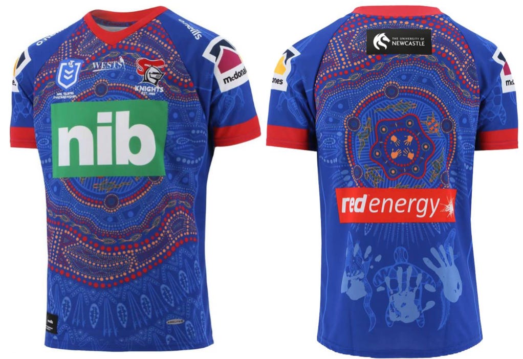
Designed by Tyler Smith and in collaboration with Edrick Lee, Connor Watson and Gehemat Shibasaki, the Jersey represents the local landscape of Newcastle and the wider region. From the forest in the south and north-west to the serene beaches stretching from the Hawkesbury to Queensland. My favourite features are on the back.
Indigenous people associate themselves with a totem (flora or fauna), representing who they are and where they’re from. The three totems, Goanna (Watson, Turtle (Shibasaki) and Saltwater Crocodile (Lee) are seen on the lower back, with the player handprints over them. This indicates their responsibility to protect that animal and carry on these traditions.
I love how the design looks, the story behind it and the message behind it. I just wish the Knights board asked NIB to let their logo be red.
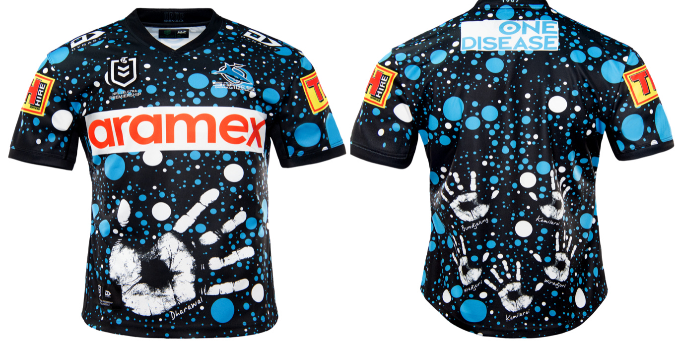
Designed by Aunty Deanna Scheiber and Sharks indigenous players, the blue-and-white dot work represents the bubbles of the ocean and saltwater bays of the land around Kurranulla where its traditional owners, inhabitants and caretakers — the Gweagal people of the Dharawal Nation — lived.
Handprints on the back of the jersey represent the indigenous players in the team, with the big handprint on the front symbolising the people of the Dharawal speaking nation.
A very nice touch both the Sharks and Zambrero should be applauded for, Zambrero has given up their sponsorships position for this game to make room for ‘One Disease’ — Whose mission is to “eliminate crusted scabies as a public health concern by 2021.”
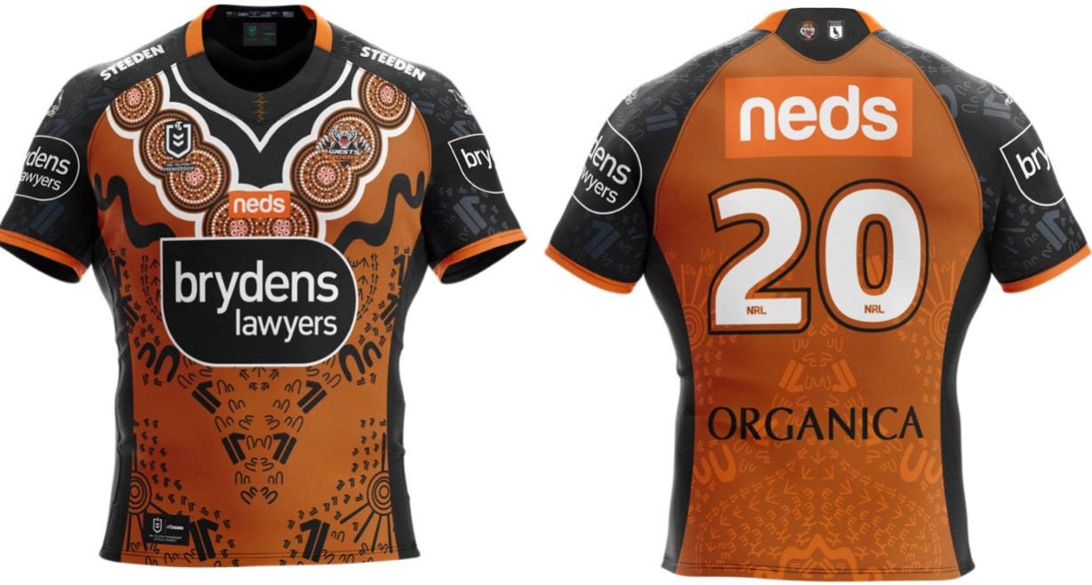
Designed by 18-year-old Breanna Price through the ‘school to work’ program, I absolutely love this design. Keeping with the traditional framework of the Tigers Jersey with the same colours and V at the neck.
With watering holes making up the ‘V’ shape — a general meeting place for Aboriginal people and the symbol for meeting place in the bottom right corner, Price says she just likes the idea of “keeping the culture alive” through her art.
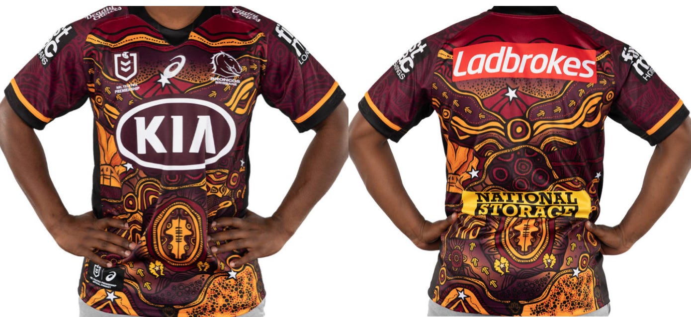
Designed by Elaine Chambers-Hegarty, she states the design started with the football shape in the centre — “representing rugby league’s far-reaching ability to bring people together” as stated on the Broncos website.
The line makings show our journeys through life, with circles representing meeting places and “acknowledging those people we meet along the way that build us as a person.”
“These communities represent our homelands that we go back to and have our stories from. Throughout the artwork, there are stars to represent ‘excellence’ and ‘achievements’ and there are six main white stars to represent the Club’s six Premiership wins.
Obviously, the colours used are the Broncos colours but I love it’s earthy feel through the colours. I loved the jersey before I knew its meaning, knowing the symbol in the middle represents a football only makes it cooler.
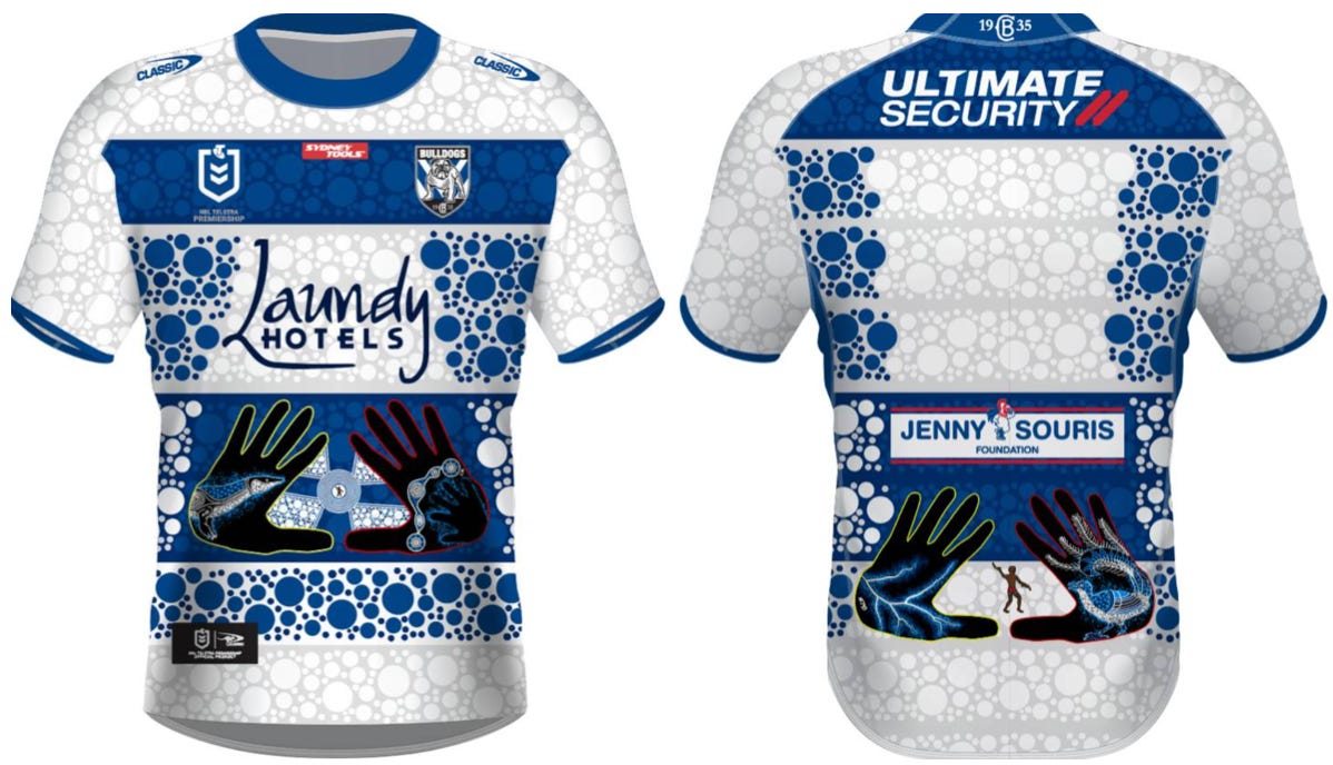
Though they are last here due to their place on the ladder, the Bulldogs indigenous jersey certainly isn’t. A simple design colour-wise with some extravagant features, there is plenty to like about this jersey.
Designed by Cleveland McGhie, Cleveland says that a lot of the inspiration for the Jersey came from the Club — the club he plays reserve grade for. His connection to Rod ‘Rocket’ Silva and his culture were the instigators for the jersey. The Tree Goanna is Rockets’ Totem, while the other hand represents the Darug people and Cook Rivers.
The coolest feature in my opinion is the seven rings and circle between the hands on the front of the jersey — representing the club’s premierships and the roles played by players and staff.
I can’t remember a better collection of jersey’s than this year. Every fan should love their club’s edition and if you don’t then plenty of club’s have one good enough that you can convince yourself to buy it. There isn’t one that I actually don’t like. If the footy disappoints this weekend, at least there’ll be something good to look at while your teams down (or up) forty points.
All information was gained by the individual club’s website and the stories behind the jersey that they provided.
I hope you enjoyed this little piece and learning about the jerseys, I certainly enjoyed learning about them as I wrote. Hopefully the footy this week can match the jerseys… it probably won't. As usual, please share with anyone you know, care about or think would find it interesting. If you really like it, feel free to buy me a coffee. Peace.
g